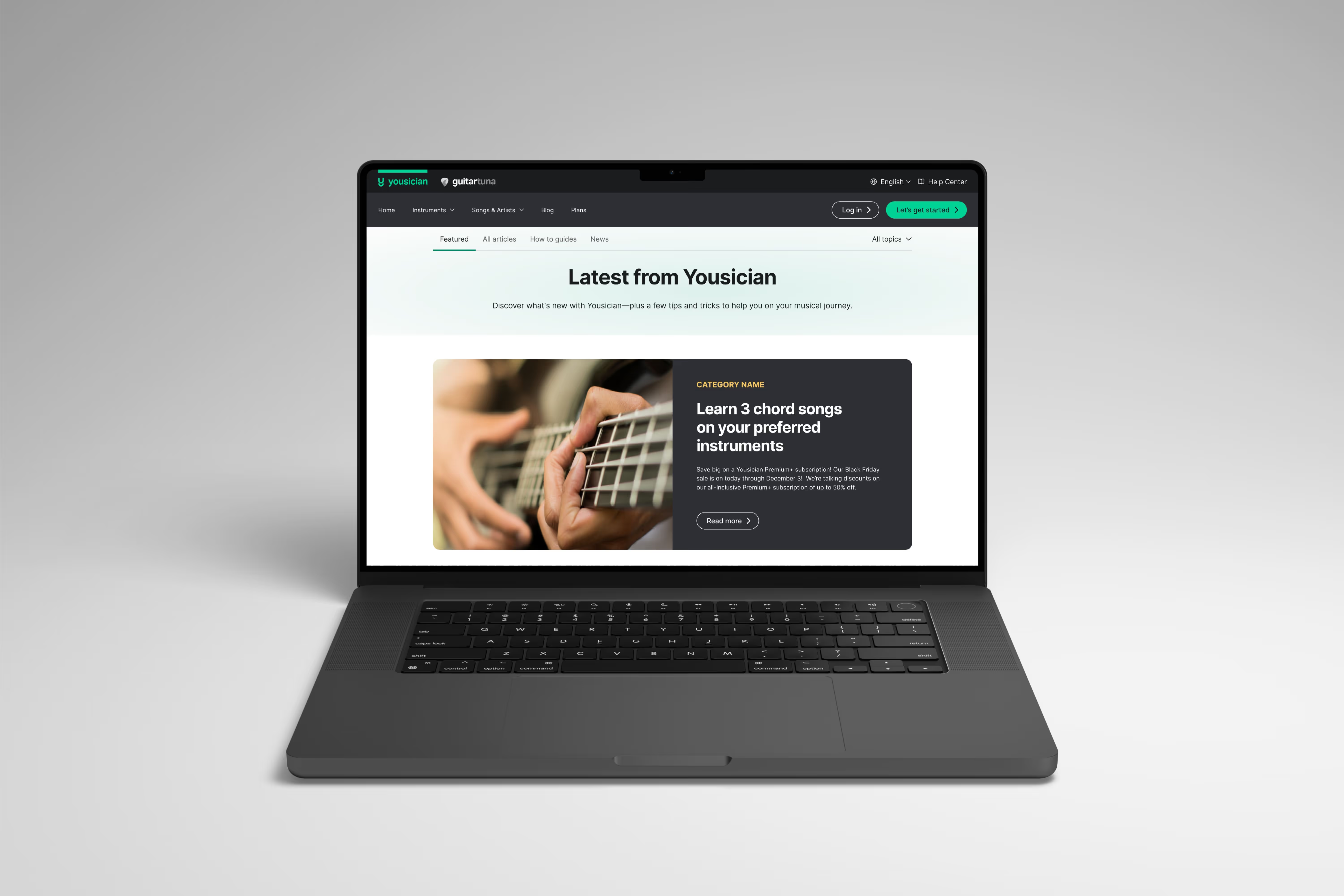

The Yousician blog had stayed visually the same for nearly four years and it showed. Much of the content wasn’t easily visible, and the overall experience felt outdated
Increase in ARPV for direct blog visitors
Projected annual revenue increase from a 2.3% ARPV uplift sitewide
Higher ARPV impact than mobile for desktop users
ARPV lift from U.S. customer market

I ran unmoderated remote tests to see how users experienced the blog. Feedback was consistent: navigation wasn’t intuitive and moving between pages felt broken. Clarity sessions also showed low engagement with CTAs, confirming the blog lacked both usability and clear entry points
Users wanted a simpler way to browse and discover. The old design made content feel invisible, with weak structure and ineffective CTAs. Data showed desktop users drove most revenue impact, while U.S. traffic accounted for the majority of ARPV growth, signaling clear regional and platform opportunities

I rebuilt the blog’s structure around discoverability. Navigation was redesigned with category and tag filters, thumbnails were enlarged for clarity, and featured stories created hierarchy. These updates gave the blog a clear editorial feel instead of a flat grid of posts.
We ran an A/B test with ~96k visitors. Direct blog visitors saw a 25% ARPV increase, and sitewide ARPV rose 2.3%, adding a projected $267K annually. Desktop drove 5x higher impact than mobile, while sticky mobile CTAs underperformed, pointing to future experiments.


The redesign modernized the blog and made content exploration seamless. The uplift proved the new structure directly supported business goals by increasing engagement and revenue. It also set a foundation for scaling new blog experiments to optimize mobile and regional performance.
This project showed me that even overlooked areas like a blog can drive real impact. By turning it into a valuable source of knowledge, it became a powerful sales and engagement channel, proof that growth often comes from the least expected places.